Case Study
Couver Financial
Couver Financial successfully launched with a brand system that’s cohesive, scalable, and distinct in the fintech space. The logo, colour palette and abstract motif seamlessly champion the brand both online and in custom-printed assets – and Couver’s in-house team is fully equipped to carry things forward thanks to clear brand guidelines and training support.
Brand System
Illustrations
Website

Where We Started
As a fintech company not playing in the usual startup sandbox, Couver Financial wanted to build a bold identity that inspired trust and clarity, with a particular goal of helping newcomers to Canada and international students meet their financial goals. They weren’t interested in disrupting the local banking market with any flashy gimmicks. They wanted their company brand to feel fresh, but not too playful — to hold authority, but feel approachable without relying on cultural clichés.
From the very start of this project, we knew the Couver brand needed range. Their organization wasn’t just launching an app or a website — they were building an entire new financial system. This meant their brand system needed to enable a cohesive visual experience across debit cards, onsite signage, mobile interfaces, website, and more.
Our vision was to create a design system that would feel consistent and authentic no matter where it showed up — bold, confident, and strong in every format.
Couver needed a brand that could live confidently in the fintech world, but not in a way that mimicked U.S. competitors or trend-driven tech brands. In order to reach and welcome their international audience (and embody their purpose of financial inclusion) they chose the key brand attributes “modern, ambitious and direct” — the characteristics “quirky, classic and youthful” were off-limits.
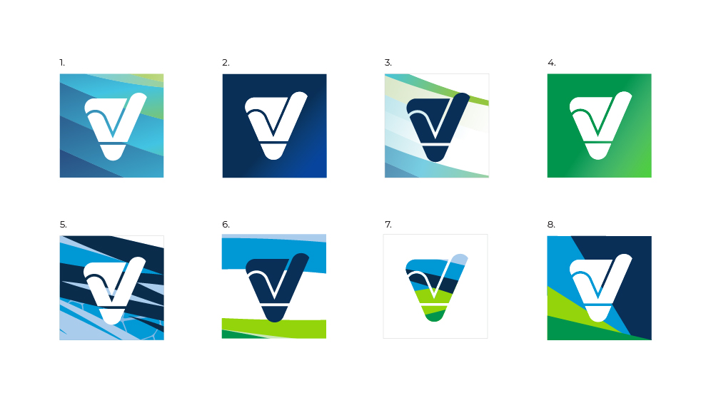
Preliminary app icon concepts
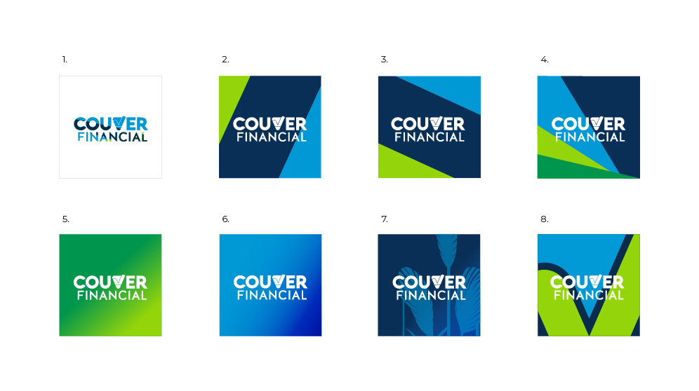
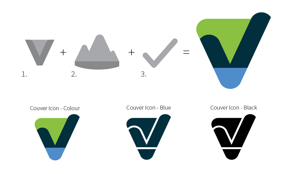
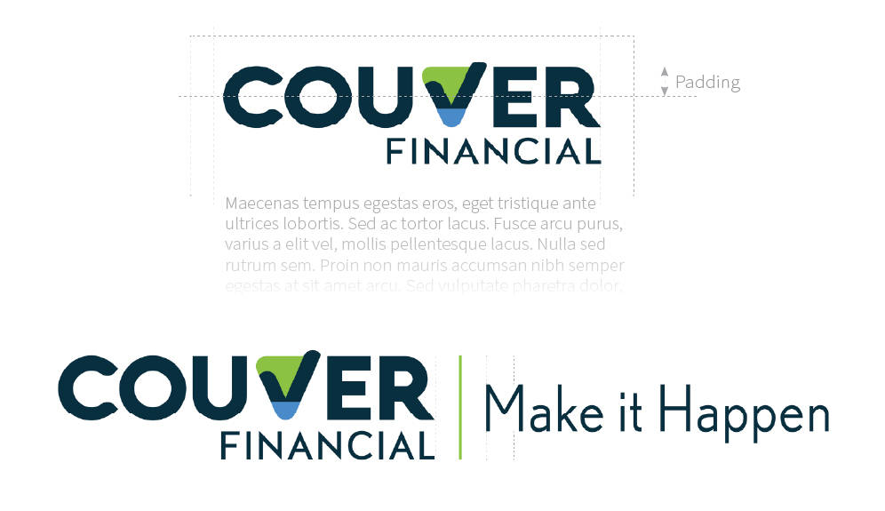
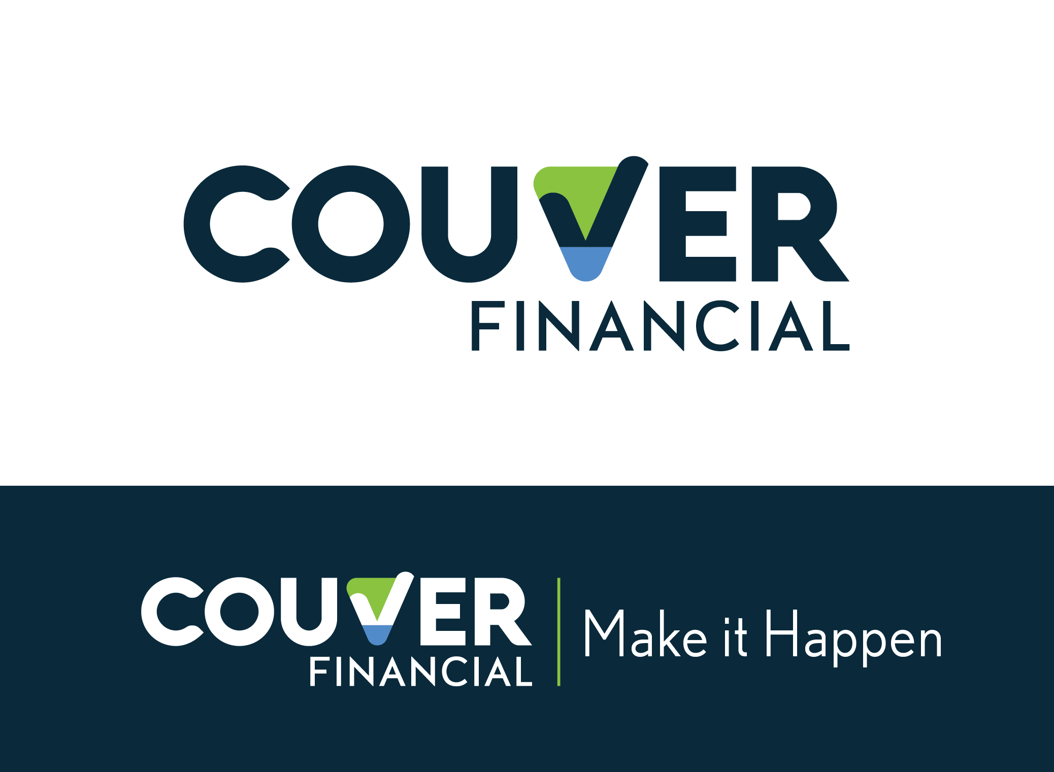
The Logo
The Couver monogram – a stylized “V” anchoring the company name within the full wordmark – is designed to represent progress and upward momentum. Using abstract colour-blocking, the monogram connotes mountains and coastlines and calls back to Couver’s seaside namesake. I created a flexible brand system that accommodates both the full horizontal wordmark and the monogram (depending on use case, sizing and available space) with clear padding and usage guidance to make the two versions easy for Couver’s team to use consistently.
Colour
I wanted to build a colour palette for Couver that had enough weight to make sense in the financial world without feeling cold or corporate.
Deep blue and black gave us a foundation of depth and authority, while the addition of lighter greens and blues helped suggest momentum, growth, and a nod to their west coast roots. This palette was applied cohesively across Couver’s entire brand system, providing a common thread between the logo, bank cards, branch signage, stationery and more.
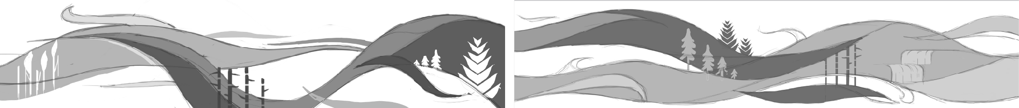
Illustration Motif
I extended the visual brand even further by working with Couver’s CEO, Max So, who had a very clear vision for an illustrated motif which could be applied to a range of assets and platforms within the Couver brand system, including environmental graphics like murals and branded bank cards.
The motif was designed to combine and represent different nature and finance-industry visuals, creating a sense of upward momentum and resonating with customers’ sense of pride in their west-coast home. I also created supporting brand elements — app icons, patterns, and modular shapes, served to weave the visuals into marketing collateral.
Illustration motif development for murals and environmental graphics


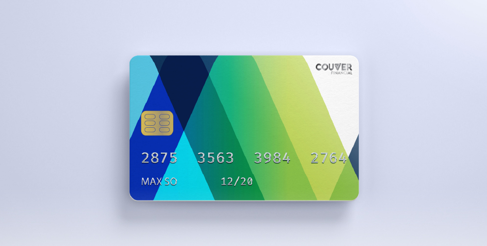
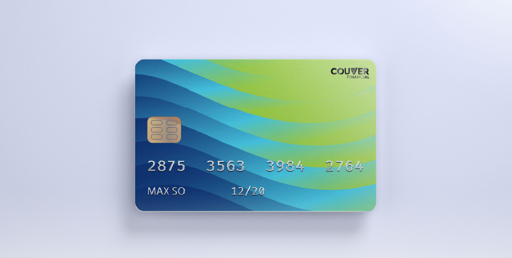
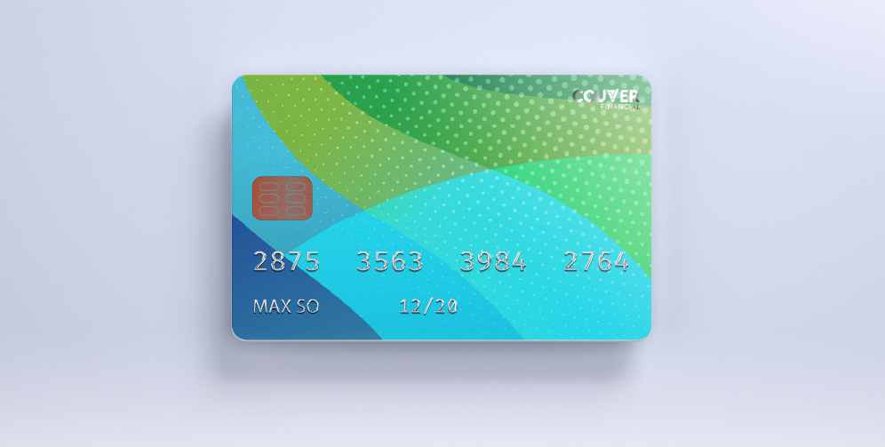
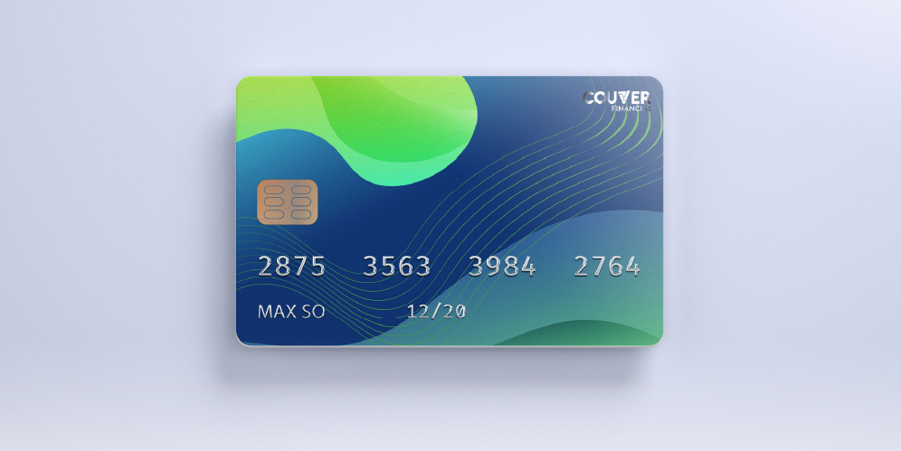
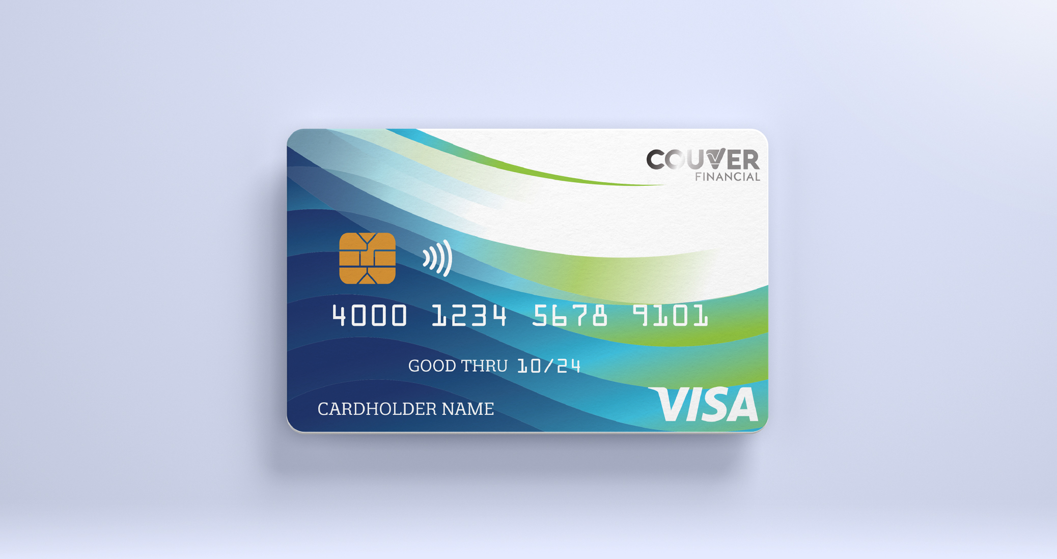
Visa Card Design
For Couver’s Visa card, the goal was to create something secure, modern, and visually distinct, incorporating colour and flow from the mural motif. I leaned into the brand’s flowing geometry—using gradients, layered curves, and subtle patterns to suggest movement, exchange, and trust. Each version balanced boldness with restraint, avoiding anything too flashy but keeping enough visual interest to stand apart in someone’s wallet. The designs carried the same DNA as Couver’s core branding, just distilled into a format that feels sleek, confident, and instantly recognizable.
Visa card concept designs
Outcome
Couver Financial successfully launched with a brand system that’s cohesive, scalable, and distinct in the fintech space. The logo, colour palette and abstract motif seamlessly champion the brand both online and in custom-printed assets – and Couver’s in-house team is fully equipped to carry things forward thanks to clear brand guidelines and training support.


Start with a discovery call.
