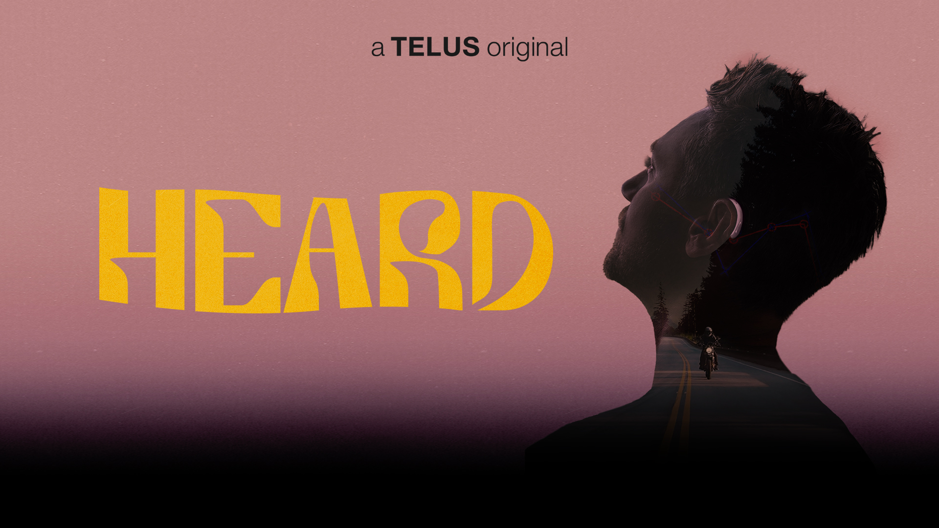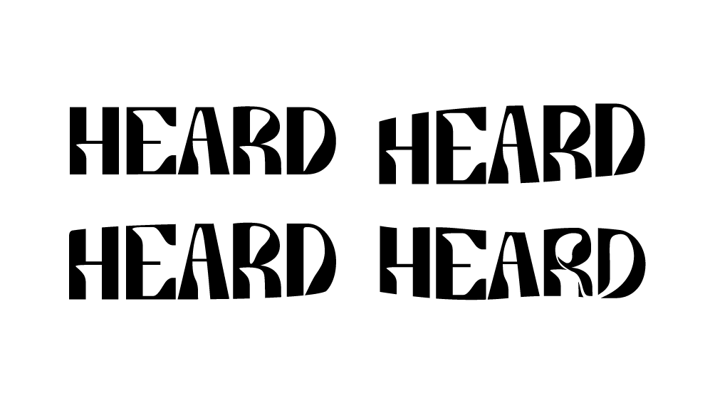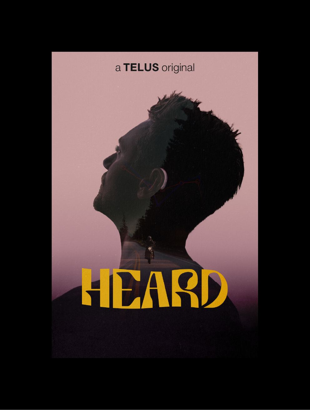

Heard Film Branding
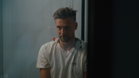
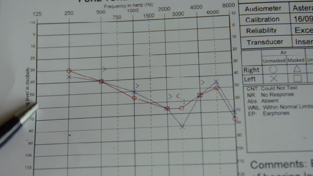
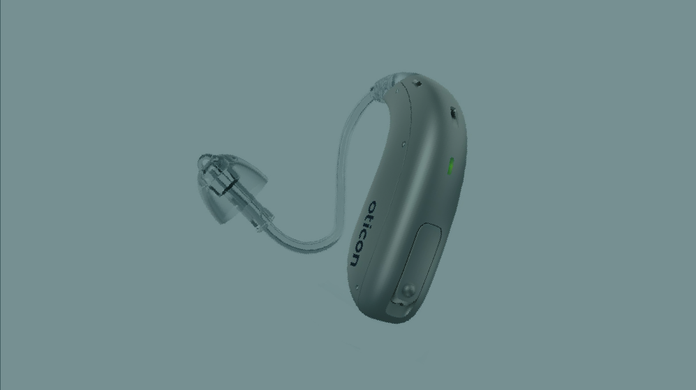
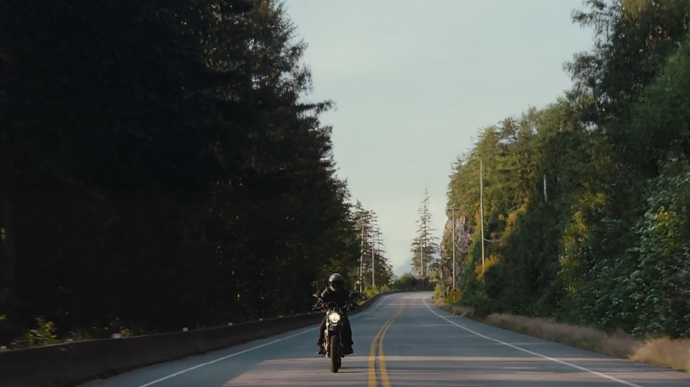
Brian Ceci is a Hard of Hearing director who partnered with producer Jamila Pomeroy (RUCKUS Machine Pictures) and Telus Originals to bring to life his first feature documentary film, Heard. Heard chronicles Brian’s own experience, as well as the stories of others searching for community in the space between Hearing and Deaf.
INDUSTRY
Film
SCOPE OF WORK
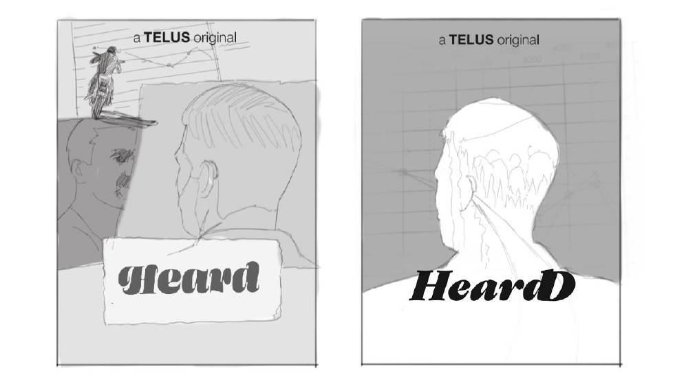
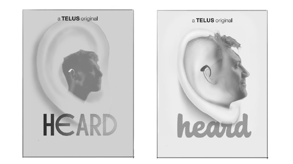
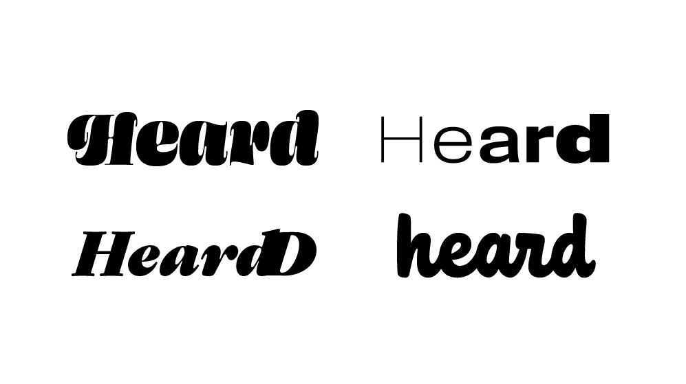
Custom Wordmark
Poster
Digital Graphics
Poster
Digital Graphics